

"Is this area safe?" is one of the most common questions renters ask before signing a lease in a part of Boston they don't know well — and one of the hardest to get a straight, trustworthy answer to. Ask online and you'll get a mix of outdated reputations, gut reactions, and "safest/most dangerous neighborhood" rankings that flatten a complicated picture into a single scary-sounding label.
This guide takes a different approach. Instead of handing you a ranking of which neighborhoods to fear, it walks through how to research a neighborhood's safety yourself — using the same official data the rankings are built on, reading that data correctly (which most people don't), and filling in what the numbers can't tell you. The goal is to help you reach an informed judgment for your own situation, not to label any neighborhood.
Start with the real data source: Boston Police, not a third-party ranking
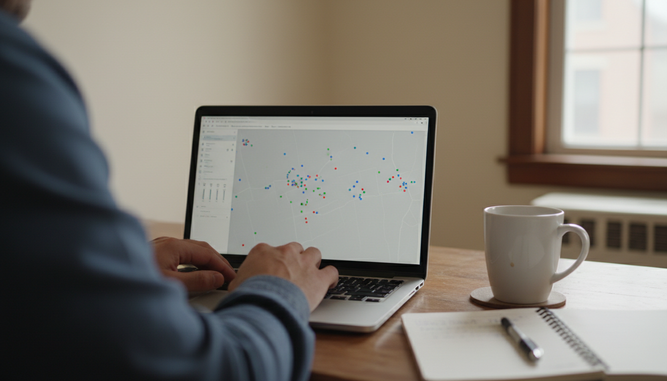
Most "Boston crime map" sites you'll find in a search are third-party aggregators that repackage public data — often wrapped in ads and reduced to a letter grade or a "danger score." You can skip the middleman and go to the source.
The City of Boston publishes crime incident reports as open data through Analyze Boston (data.boston.gov), drawn directly from the Boston Police Department's records. The dataset covers incidents the BPD responds to, with the type of offense and when and where it occurred, updated on an ongoing basis (records run from 2015 to the present). Because it's the actual source data rather than a repackaged score, you can look at what specifically is being reported in an area rather than trusting someone else's summary judgment.
Starting here matters because the raw incident data lets you ask better questions: what kind of incidents, where exactly, and when, instead of accepting a one-dimensional "safe" or "unsafe" verdict.
How to read a crime map without being fooled
This is the part almost every ranking gets wrong, and understanding it will change how you see every crime map you look at.
Crime maps usually count incidents relative to the resident population. That means a neighborhood with lots of shops, restaurants, nightlife, transit stations, or big parks can look alarmingly "hot" on a map even if it's perfectly ordinary for the people who actually live there. Crime tends to follow crowds and activity, so a busy commercial or transit-heavy block will rack up reported incidents (many involving visitors, not residents) while the rate gets divided by a relatively small residential population. The result: downtown cores, entertainment districts, and areas around major transit hubs frequently read as high-crime on a map when the day-to-day experience of living a few streets over is quiet.
So a red block does not automatically mean an unsafe place to live. A few habits help you read the map honestly:
- Separate violent crime from property crime. For most renters, the realistic day-to-day risks are property crimes like car break-ins, package theft, and bike theft, not violent crime. A map that lumps everything together can make a low-violent-crime area look scary. Look at what type of incidents are actually driving the color.
- Zoom in to the block, not the neighborhood. Neighborhood-level averages hide huge block-to-block variation. The specific street you're considering can be very different from the neighborhood's overall number.
- Notice what's nearby. A cluster of incidents around a mall, a stadium, a nightlife strip, or a transit station usually reflects that destination, not the residential streets around it.
- Look at trends, not a single snapshot. Is reported crime in the area rising, falling, or flat over the last few years? A trend tells you more than one month's dots.
What the data can't tell you — and how to fill the gaps
Even read correctly, crime data is only part of the picture. The rest you gather with your own feet.
Visit at different times of day and days of the week
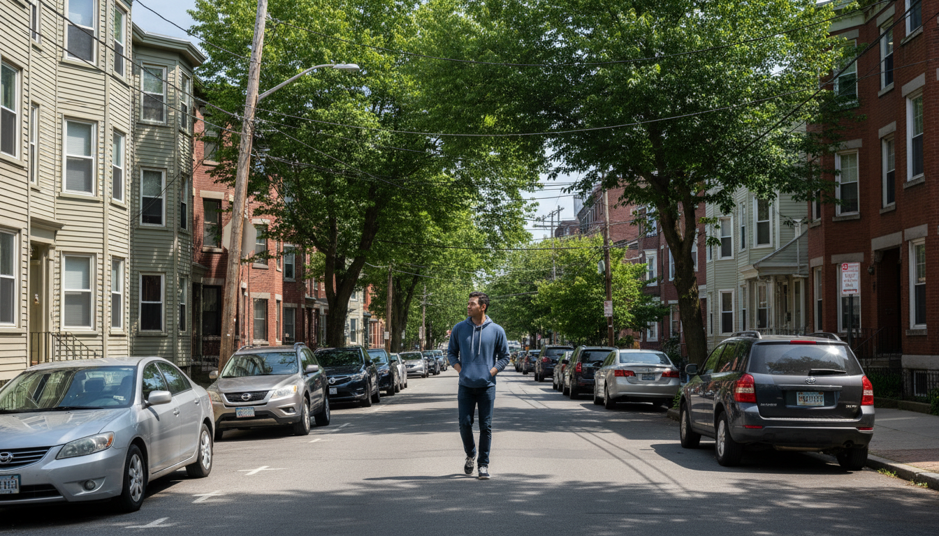
A block can feel completely different at 2 p.m. on a Tuesday than at 11 p.m. on a Saturday. Walk the specific street you're considering, and the walk between it and the nearest T stop, in daylight and after dark. Notice lighting, foot traffic, how well-kept things are, and simply how you feel there. Your own first-hand impression is data the map doesn't have.
Talk to current residents and local businesses
The people who actually live and work in an area will tell you things no dataset will. Chat with someone at a local coffee shop or corner store, or ask a current resident of the building. Ask specifically, with something like "how's the block at night?" or "any issues with car break-ins or packages?", rather than a vague "is it safe?", which tends to get a vague answer.
Separate outdated reputation from current reality
This is the trap that catches a lot of people, especially those relying on family or friends who knew Boston years ago. Neighborhoods change, sometimes a lot, over a decade or two, and reputations lag well behind reality in both directions. As one renter weighing a move put it, the warnings they were getting were based on experiences that were simply "outdated." Weight what you can verify now (current data, a current visit, current residents) over a reputation someone formed years ago.
Turning it into a decision for your situation
"Safe enough" isn't one universal bar; it depends on what you actually care about. A renter who parks a car on the street cares a lot about vehicle break-ins. Someone who commutes home late cares about the walk from the station at night. Someone with a ground-floor unit thinks about package theft and break-ins differently than someone on the fourth floor. Use the data and your legwork to answer your specific questions, not an abstract "is this a good or bad neighborhood."
And whatever you conclude, renters insurance is a cheap, worthwhile backstop against the property-crime risks that exist basically everywhere. It's a small monthly cost that covers theft and a lot more, regardless of which neighborhood you choose.
FAQ
Where's the best place to check Boston crime data?
Go to the source: the City of Boston's open-data portal, Analyze Boston (data.boston.gov), which publishes Boston Police Department incident reports. It's more reliable than ad-driven third-party "crime score" sites that repackage the same data.
Why does a neighborhood look dangerous on a crime map but feel fine in person?
Crime maps usually count incidents relative to how many people live in an area, so places with lots of shops, nightlife, parks, or transit read "high" because crime follows crowds — even when the residential streets nearby are quiet. A red block isn't automatically an unsafe place to live.
What should I look at besides the overall crime rate?
Separate violent crime from property crime (property crime is the more realistic day-to-day concern for most renters), zoom to the specific block rather than the whole neighborhood, and look at the trend over several years rather than one snapshot.
How do I judge a neighborhood beyond the numbers?
Visit the specific street at different times of day and after dark, walk the route to the nearest T stop, and talk to current residents or local business owners with specific questions.
How much should I trust a neighborhood's reputation?
Cautiously. Neighborhoods change over years, and reputations lag reality in both directions. Prioritize what you can verify now (current data, a current visit, current residents) over a reputation formed a decade ago.
Is renters insurance worth it for safety concerns?
It's a low-cost, worthwhile backstop against property crime such as theft and break-ins, which exists to some degree everywhere, so it's worth having regardless of the neighborhood.
This article is informational and isn't legal or safety advice.